

Why Porcelain Tile Shade Variation Becomes Obvious After The Cartons Open
Jul 23, 2026
Leave a message
One carton of beige porcelain tiles can look perfectly acceptable. Open three cartons and the conversation changes.
The first piece looks warm. The second is a little cooler. The third sits somewhere between them. Nobody wants to call it a defect immediately, because each tile looks fine by itself. The problem appears when the pieces start living together on the same floor.
This is why porcelain tile shade variation is one of those topics that sounds boring until a project buyer has to explain it to an installer.
The issue is not always dramatic. Sometimes it is just enough to make a corridor feel uneven, or a showroom board feel less tidy than the photo promised.

Firing leaves a memory in the color
SACMI describes MAESTRO as a roller kiln range for firing ceramic slabs and tiles, with heat and air control systems. Refin's tile shade FAQ explains the buyer-facing side more simply: shade marks a specific color tone within a production batch, and slight variation can come from kiln temperature and raw material composition.
That is the neat version.
On a warehouse floor, it becomes less neat. A distributor opens cartons from two shipments and the beige does not sit exactly the same. A marble look porcelain tile keeps the same vein design but the background tone has moved slightly. Under warm showroom light, the difference hides. Near the doorway, it comes back.
Most overseas buyers are not trying to become kiln experts. The useful point is simpler: color is partly a firing result, not only a print result.
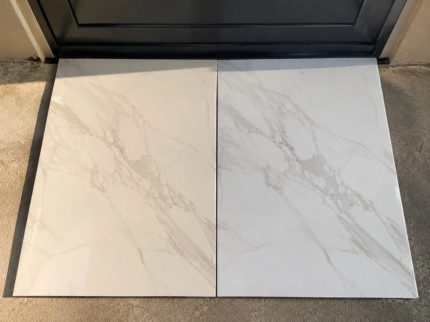
A shade label is useful only if people actually read it
Most tile people know shade labels exist. The trouble is that they are sometimes treated like carton decoration.
For importers, the first useful habit is simple: keep shade and batch information visible during sample approval, loading, warehouse sorting, and repeat orders. If the project is small, the risk may stay small. If the order is for hotel corridors, apartment floors, or a retail chain rollout, the shade conversation deserves more patience.
This is where real work gets a little dull. Someone has to compare carton labels. Someone has to keep approved samples. Someone has to notice when a reorder is close but not identical. It is not the glamorous side of porcelain tile supply, but it saves arguments later.
MingWei Ceramic Tile usually treats shade discussion as part of order confirmation for marble look porcelain tiles, beige porcelain tiles, and 600x1200 porcelain tiles, especially when the buyer is planning repeat stock or project delivery.
The showroom board can lie kindly
A showroom board is helpful, but it is also small.
One board may carry four pieces from a controlled sample set. The lighting is good. The display angle is flattering. A salesperson knows exactly where to stand when showing it. Then the same tile goes into a larger room and the buyer sees something different: the tone variation that looked natural on the board now repeats across a floor.
This is not always bad. Stone-look porcelain tiles need some movement. A flat, lifeless beige can look cheaper than a soft natural variation. The question is whether the variation looks intentional or accidental.
There is a small trick we like: place the sample beside a plain white sheet, then beside a warmer tile from the same family. Not for a laboratory answer. Just to force the eye to stop being polite.

Do not mix cartons casually on visible areas
Installers often understand shade risk faster than office buyers do. They see it when the tiles are spread across the floor.
If a project has mixed shade cartons, the handling method matters. Some variation can be blended across a large area. Some is better separated by room, floor, or zone. The risky decision is to pretend all cartons are the same because the product name is the same.
For distributors, carton sorting feels like extra work until a complaint arrives. For contractors, it can decide whether the installation looks controlled. For showroom buyers, it explains why a reorder sample is better checked beside the old display, not judged from a phone photo.
Porcelain tile color consistency is not about making every piece identical. Natural-looking tile needs room to breathe. But when the shade moves too far, the room stops looking designed and starts looking assembled from leftovers.
That is the point where a small label on a carton becomes a very practical piece of information.